
CSS continues to evolve, offering new tools and techniques for web designers and developers to create visually stunning and highly functional websites. Staying up to date with the latest trends and best practices is essential. Here are 10 CSS tips you must know about in 2024 to enhance your web development skills and create cutting-edge designs.
Check also 10 HTML Tips You Must Know About in 2024.
1. The :has() pseudo-class Selector
The :has() pseudo-class selector is a powerful addition to CSS, allowing you to style elements based on their descendants or other specific conditions within them. This selector enables you to apply styles to a parent element if it contains certain child elements or meets specific criteria. For example, you can highlight a div that contains an image or change the background of a list item that has a link. The :has() selector greatly enhances the flexibility and specificity of CSS, making it easier to create dynamic, conditionally styled layouts.
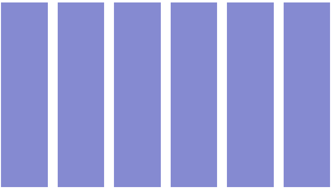
Example - Card hover with :not() Selector
- Create index.html and style.css files:
index.html
<!DOCTYPE html>
<html lang="en">
  <head>
    <meta charset="UTF-8" />
    <meta name="viewport" content="width=device-width, initial-scale=1.0" />
    <title>Document</title>
    <link rel="stylesheet" href="style.css" />
  </head>
  <body>
    <div class="cards">
      <div class="card"></div>
      <div class="card"></div>
      <div class="card"></div>
      <div class="card"></div>
      <div class="card"></div>
      <div class="card"></div>
    </div>
  </body>
</html>
style.css file:
.cards {
  display: flex;
  gap: 1rem;
}
.card {
  width: 100%;
  height: 300px;
  background-color: rgb(12, 22, 164);
  transition: opacity 0.4s ease;
}
.cards:hover > :not(:hover) {
  opacity: 0.5;
}
Now we have a six cards inside a flex container

- Add hover to them
.cards:hover > :not(:hover) {
  opacity: 0.5;
}
Now we have a bug. If you hover between the cards, all cards will have an opacity of 0.5, and none will be selected. To fix it add visibile to the .card selector
.cards {
  display: flex;
  gap: 1rem;
  visibility: hidden;
}
.card {
  visibility: visible;
  width: 100%;
  height: 300px;
  background-color: rgb(12, 22, 164);
  transition: opacity 0.4s ease;
}
.cards:hover > :not(:hover) {
  opacity: 0.5;
}
2. The :focus-within pseudo-class
The CSS :focus-within selector is a powerful tool that allows you to apply styles to a parent element when any of its child elements receive focus. This is particularly useful for enhancing user interaction with forms, menus, and interactive components. By using :focus-within, you can highlight or style entire sections of your page when users navigate through them using a keyboard or mouse, improving accessibility and user experience.
As we know, the traditional method for creating custom radio buttons involved using the adjacent sibling combinator (+). You’re probably familiar with it. However, modern CSS features now offer a different and more efficient approach.
Example: Radio Buttons with :focus-within
- Create a html and css files:
index.html
<!DOCTYPE html>
<html lang="en">
  <head>
    <meta charset="UTF-8" />
    <meta name="viewport" content="width=device-width, initial-scale=1.0" />
    <title>Document</title>
    <link rel="stylesheet" href="style.css" />
  </head>
  <body>
    <div class="radio-button">
      <input
        id="rb-1"
        class="radio-button__input sr-only"
        type="radio"
        name="radio"
        checked
      />
      <label for="rb-1" class="radio-button__label">Example 1</label>
    </div>
    <div class="radio-button">
      <input
        id="rb-2"
        class="radio-button__input sr-only"
        type="radio"
        name="radio"
      />
      <label for="rb-2" class="radio-button__label">Example 2</label>
    </div>
  </body>
</html>
style.css
body {
  display: flex;
  justify-content: center;
  align-items: center;
  height: 90vh;
}

.sr-only {
  width: 1px;
  height: 1px;
  clip-path: inset(50%);
  overflow: hidden;
  position: absolute;
  white-space: nowrap;
}

.radio-button {
  --radio-button-size: 1rem;
  --radio-button-gap: 1rem;
  --radio-button-dot-size: 0.5rem;

  display: inline-flex;
  align-items: center;
  position: relative;
  isolation: isolate;
}

.radio-button::before {
  content: '';
  box-sizing: border-box;
  width: var(--radio-button-size);
  height: var(--radio-button-size);

  border: 1px solid #242424;
  border-radius: 100%;
  position: absolute;
  z-index: -1;
}

.radio-button__label {
  display: grid;
  padding-left: calc(var(--radio-button-dot-size) + var(--radio-button-gap));
}

.radio-button__label::before,
.radio-button__label::after {
  content: '';
  border-radius: 100%;
  opacity: 0;

  position: absolute;
  align-self: center;
  left: var(--radio-button-dot-size);
  transform: translateX(-50%);
  scale: 0;
  transform-origin: left center;
}

.radio-button__label::before {
  border-top: var(--radio-button-dot-size) solid #242424;
  border-left: var(--radio-button-dot-size) solid #242424;
  transition: 0.3s;
}

.radio-button__label::after {
  width: var(--radio-button-dot-size);
  height: var(--radio-button-dot-size);

  background-color: #2500e0;
  transition: 0.6s;
}
We’ve created simple buttons, and now there’s just one final step. We need to write the code for the states when the radio button is focused or selected. As I mentioned earlier, this will be based on the adjacent sibling combinator (+).
.radio-button__input:checked + .radio-button__label::before {
  opacity: 1;
  scale: 1;
}

.radio-button__input:focus + .radio-button__label::after {
  scale: 3.6;
  opacity: 0.2;
}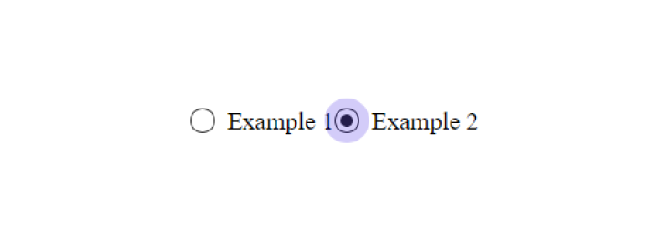
What’s the issue? If, in the markup, the element with the class .radio-button__input accidentally stops being placed before the .radio-button__label element, the styling will break completely. This is the downside of relying on the adjacent sibling combinator (+).
The modern CSS doesn’t have this bug because it relies on the :has() and :focus-within pseudo-classes.
- Add :focus-within selector
.radio-button:has(:checked) .radio-button__label::before {
  opacity: 1;
  scale: 1;
}

.radio-button:focus-within .radio-button__label::after {
  scale: 3.6;
  opacity: 0.2;
}
3. The inset Property
Sometimes, elements with the position property set to absolute are used to stretch an element across all available space. The most common code for this looks like:
.parent {
  position: relative;
}

.parent::before {
  content: '';
  width: 100%;
  height: 100%;

  position: absolute;
  top: 0;
  left: 0;
}
This snippet is outdated because it can be simplified. The inset property allows you to set the coordinates for all four sides of an element at once, replacing the need for top, right, bottom, and left.
To update the example, you can remove the width and height properties. Since .parent has position: absolute, its size can be determined by the specified offsets.
In this case, we’ll use inset: 0 to achieve the same effect.
.parent {
  position: relative;
}

.parent::before {
  content: '';
  position: absolute;
  inset: 0;
}
4. CSS Variables
CSS Variables, also known as custom properties, are a powerful feature that allows you to store and reuse values throughout your stylesheet. They enable you to define values like colors, fonts, or dimensions in one place, making your code more maintainable and flexible.
When coding a project, it’s common to write a lot of rules inside media queries, which can make the code difficult to navigate. To illustrate this problem, I’ll provide styles for two elements with the classes .heading and .description.
.heading {
  font-size: 2rem;
}

.description {
  font-size: 0.75rem;
}

@media (min-width: 641px) {
  .heading {
    font-size: 3rem;
  }

  .description {
    font-size: 1.25rem;
  }
}

@media (min-width: 1025px) {
  .heading {
    font-size: 3.5rem;
  }

  .description {
    font-size: 1.5rem;
  }
}
Previously, we had to write separate rules for every property change. For instance, to adjust the font-size in each media query, we needed two rules for both .heading and .description. This approach was inefficient before custom properties came along.
Now, with custom properties, we can set base values and modify them inside media queries using a parent element. This way, we only need one rule per media query instead of many.
.heading {
  font-size: var(--heading-font-size, 2rem);
}

.description {
  font-size: var(--hint-font-size, 0.75rem);
}

@media (min-width: 648px) {
  .text {
    --heading-font-size: 3rem;
    --hint-font-size: 1.25rem;
  }
}

@media (min-width: 1280px) {
  .text {
    --heading-font-size: 3.5rem;
    --hint-font-size: 1.5rem;
  }
}
5. place-items property
For a long time, the transform property has been the go-to method for centering an element with position: absolute. The technique involves two key steps.
First, move the element 50% away from the top and left edges using the top and left properties. Then, apply translate(-50%, -50%) to shift it back by half of its width and height.
.elem {
  width: 200px;
  height: 200px;
  position: relative;
}

.elem::before {
  width: 22px;
  height: 22px;

  position: absolute;
  top: 50%;
  left: 50%;
  transform: translate(-50%, -50%);
}
Today, there’s a simpler method available. We can use the place-items property.
.elem {
  width: 20rem;
  height: 20rem;

  display: grid;
  place-items: center;
}

.elem::before {
  width: 2rem;
  height: 2rem;
  position: absolute;
}
6. scrollbar-gutter property
The scrollbar-gutter property provides control over the space allocated for scrollbars in your layout. This property helps manage how scrollbars impact the layout, especially when it comes to accommodating their width and avoiding layout shifts when they appear or disappear.
It ensures that space is reserved for scrollbars, preventing content from shifting when the scrollbar appears.
body {
  scrollbar-gutter: stable;
}
7. system-ui fonts
Now you can change something like this:
body {
  font-family: var(
    --main-font,
    -apple-system,
    BlinkMacSystemFont,
    Segoe UI,
    Roboto,
    Open Sans,
    Ubuntu,
    Fira Sans,
    Helvetica Neue,
    sans-serif
  );
}
to:
body {
  font-family: var(--main-font, system-ui);
}
8. :lang() pseudo class
How to Use :lang() Pseudo-Class
Syntax:
:lang(en) {
  font-style: italic;
}
language specifies the language code (e.g., en, fr, de).
Example Usage
:lang(fr) {
  font-family: 'Courier New', monospace;
  text-align: center;
}
HTML Example:
<p lang="en">This is an English paragraph.</p>
<p lang="fr">Ceci est un paragraphe en français.</p>
Combine :lang() pseudo class with :not()
:not(:lang(fr)) {
  font-style: italic;
}
In the HTML above, the paragraphs will be styled according to their language attribute, demonstrating how the :lang() pseudo-class can be used to handle language-specific styling effectively.
9. aspect-ratio property
The aspect-ratio property in CSS is a powerful tool that allows you to control the aspect ratio of an element, ensuring it maintains a specific ratio between its width and height. This property is especially useful for responsive design, maintaining the proportion of elements across various screen sizes.
Syntax:
.img {
  aspect-ratio: 1/3;
}
Example Usage
.media {
  aspect-ratio: 12 / 8; /* Width is 12 units for every 8 units of height */
  width: 100%;
  background-color: 'red';
}
By using the aspect-ratio property, you can create more flexible and responsive designs, ensuring elements maintain their proportions across different devices and screen sizes.
10. :is() pseudo-class
The :is() pseudo-class in CSS simplifies applying styles to multiple selectors by allowing you to group them together in a single rule. This makes your CSS more readable and easier to manage, especially when you need to apply the same styles to various elements.
Example Usage
Syntax:
:is(h1, h2, h3) {
  text-transform: uppercase;
}
In this example, all h1, h2, and h3 elements will have uppercase text.
Combining with Other Selectors
:is(.button, .link) {
  color: white;
  padding: 1rem;
}
:is() reduces repetition by allowing you to group multiple selectors together.
By mastering these 10 CSS tips, you’ll be well-equipped to create modern, responsive, and dynamic web designs in 2024. Whether you’re building a personal project or working on a client site, these tips will help you write cleaner, more efficient CSS that stands out.