
In day‑to‑day frontend work, we keep solving the same problems:
- building consistent buttons, forms, layouts, and modals
- making everything responsive on phones, tablets, and desktops
- keeping colors, typography, and spacing uniform across the app
- implementing accessibility and keyboard navigation correctly
- fighting with ever‑growing CSS files and design drift
Writing CSS from scratch for every new page quickly turns into a chore. That’s exactly the type of repetitive work Chakra UI removes from your life.
In this guide, we’ll look at how Chakra UI v3 paired with React helps you:
- stop hand‑writing CSS for every component
- keep a single source of truth for design tokens
- ship accessible UI without memorizing every WAI‑ARIA rule
- build responsive layouts without writing
@mediaqueries - keep performance under control with tree‑shaking and minimal styling runtime
Along the way we’ll use improved code samples, renamed variables, and modern patterns.
Official docs: chakra docs
Why Styling Libraries Exist at All
Let’s be honest: vanilla CSS is powerful, but it doesn’t scale nicely in large React apps.
Typical problems when you style everything manually:
1. Slowness
You might spend hours on details like hover states, focus rings, input errors, spacing between elements, and layout quirks.
2. Visual Inconsistency
You start with a clean design, but six months later:
different border radii, slightly different blues, spacing that “almost” matches, and three button variations that should have been one.
3. Accessibility Debt
Screen readers, roles, ARIA attributes, focus management, ESC handling, keyboard navigation – all this is crucial, but hard to do correctly and consistently with plain HTML + CSS.
4. Bloated CSS
Legacy styles accumulate: old classes, unused helpers, and confusing overrides. Bundle size grows, and nobody wants to delete anything because “it might be used somewhere”.
Component styling libraries like Chakra UI solve these with:
- ready‑made building blocks (Button, Stack, Modal, Menu, etc.)
- theme tokens instead of magic values
- accessibility first approach
- built‑in responsiveness
Chakra takes this approach and makes it very ergonomic for React.
1. Styling with Props Instead of Raw CSS
In Chakra, style props are the core idea:
you describe what the component should look like directly in JSX instead of switching between JS and CSS files.
A basic button, Chakra style
import { Button } from "@chakra-ui/react"

export function SendMessageButton() {
  return (
    <Button
      colorScheme="teal"
      size="lg"
      borderRadius="xl"
      boxShadow="md"
      _hover={{
        boxShadow: "xl",
        transform: "translateY(-1px)",
      }}
    >
      Send message
    </Button>
  )
}
This one component includes:
- colors
- size
- border radius
- shadow
- hover state
No separate CSS file, no BEM class names, no :hover selectors.
Equivalent CSS for comparison
.primary-button {
  background-color: #319795;
  color: #fff;
  padding: 0.75rem 1.5rem;
  border-radius: 0.75rem;
  box-shadow: 0 4px 6px rgba(0, 0, 0, .1);
  transition: all 0.15s ease-out;
}

.primary-button:hover {
  box-shadow: 0 10px 15px rgba(0, 0, 0, .15);
  transform: translateY(-1px);
}export function SendMessageButtonRaw() {
return <button className="primary-button">Send message</button>
}Both work, but the Chakra version:
- keeps markup and styles in one place
- is more discoverable (props are auto‑completed in your IDE)
- plays nicely with dynamic values coming from state or props
2. A Single Theme Controls the Whole App
Instead of scattering values like #319795 and 1.5rem across components, Chakra encourages you to put them into a theme.
You can extend the default theme or create your own system.
Minimal theme setup with design tokens
import {
  ChakraProvider,
  createSystem,
  defaultConfig,
  defineConfig,
} from "@chakra-ui/react"

const designConfig = defineConfig({
  theme: {
    tokens: {
      colors: {
        accent: { value: "#6ED209" },
        surface: { value: "#F8FFF2" },
      },
      radii: {
        pill: { value: "999px" },
      },
    },
  },
})

const designSystem = createSystem(defaultConfig, designConfig)

export function RootApp({ children }: { children: React.ReactNode }) {
  return <ChakraProvider value={designSystem}>{children}</ChakraProvider>
}
Now you can use accent and surface anywhere:
import { Box, Button } from "@chakra-ui/react"

export function AccentCard() {
  return (
    <Box bg="surface" p={6} borderRadius="lg">
      <Button bg="accent" borderRadius="pill">
        Accent action
      </Button>
    </Box>
  )
}
Change accent in one place → entire app updates.
Extracting theme configuration into its own file
A common pattern is to keep all theme logic in something like theme/system.ts:
// theme/system.ts
import { defineConfig, createSystem, defaultConfig } from "@chakra-ui/react"

const designConfig = defineConfig({
  globalCss: {
    "html, body": {
      margin: 0,
      padding: 0,
      fontFamily: "system-ui, -apple-system, BlinkMacSystemFont, sans-serif",
      scrollBehavior: "smooth",
    },
  },
  theme: {
    tokens: {
      colors: {
        "ink-strong": { value: "#1A202C" },
        "ink-soft": { value: "#718096" },
        "paper": { value: "#F7FAFC" },
      },
    },
    semanticTokens: {
      colors: {
        appBackground: {
          value: {
            base: "{colors.paper}",
            _dark: "#1A202C",
          },
        },
        appText: {
          value: {
            base: "{colors.ink-strong}",
            _dark: "{colors.paper}",
          },
        },
      },
    },
  },
})

export const designSystem = createSystem(defaultConfig, designConfig)
Then in your entry point:
// app/providers.tsx
import { ChakraProvider } from "@chakra-ui/react"
import { designSystem } from "@/theme/system"

export function Providers({ children }: { children: React.ReactNode }) {
  return <ChakraProvider value={designSystem}>{children}</ChakraProvider>
}
This gives you one place to tune your entire design language.
3. Accessibility Built In by Default
Manually making UI accessible means dealing with:
-
role,aria-*attributes - focus traps for modals
- escape handling
- tab order for menus
- keyboard navigation for lists and dialogs
-
aria-livefor announcements
Chakra UI bakes this into its components.
Accessible alert message
import { Alert, AlertIcon, AlertTitle, AlertDescription } from "@chakra-ui/react"

export function ProfileSavedNotice() {
  return (
    <Alert status="success" borderRadius="md" mb={4}>
      <AlertIcon />
      <AlertTitle mr={2}>Profile updated</AlertTitle>
      <AlertDescription>
        Your changes have been saved successfully.
      </AlertDescription>
    </Alert>
  )
}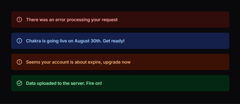
This alert component already includes:
- correct
role -
aria-live="polite" - semantic structure
Accessible dropdown menu with keyboard support
import {
  Menu,
  MenuButton,
  MenuItem,
  MenuList,
  Button,
} from "@chakra-ui/react"
import { ChevronDownIcon } from "@chakra-ui/icons"

export function UserActionsMenu() {
  return (
    <Menu>
      <MenuButton
        as={Button}
        rightIcon={<ChevronDownIcon />}
        variant="outline"
      >
        User actions
      </MenuButton>
      <MenuList>
        <MenuItem>View profile</MenuItem>
        <MenuItem>Change password</MenuItem>
        <MenuItem color="red.500">Log out</MenuItem>
      </MenuList>
    </Menu>
  )
}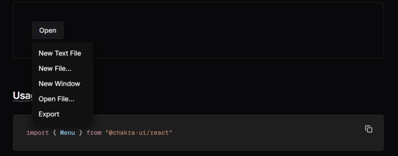
You get:
- Arrow key navigation
- Esc to close
- focus return to the button
- proper ARIA attributes on the menu and items
No custom JS required.
4. Responsive UI Without Writing Media Queries
Chakra supports array syntax and object syntax for responsive values.
Array syntax (simple breakpoint‑based)
import { Box, Text, Button } from "@chakra-ui/react"

export function ResponsivePanel() {
  return (
    <Box
      width={["100%", "90%", "70%", "50%"]}
      p={[3, 4, 6]}
      fontSize={["sm", "md", "lg"]}
      display={["block", "flex"]}
    >
      <Text flex="1" mb={[3, 0]} mr={[0, 4]}>
        This block adapts across breakpoints.
      </Text>
      <Button size={["sm", "md"]}>Try it now</Button>
    </Box>
  )
}
Interpretation (with default breakpoints [base, sm, md, lg, xl]):
-
width="100%"on base -
width="90%"onsm -
width="70%"onmd -
width="50%"onlg+
Object syntax (named breakpoints)
export function ResponsiveStack() {
  return (
    <Box
      display={{ base: "block", md: "flex" }}
      gap={{ base: 3, md: 6 }}
      p={{ base: 3, md: 6 }}
    >
      <Box bg="gray.100" p={4} flex="1">
        Left side content
      </Box>
      <Box bg="gray.50" p={4} flex="1">
        Right side content
      </Box>
    </Box>
  )
}
Compared to raw CSS, this eliminates:
- multiple
@mediablocks - duplicated selectors
- constant breakpoint lookup
5. Layout Components: Stack, Flex, Grid
Chakra includes layout primitives that replace dozens of custom CSS utilities.
Vertical spacing with Stack
import { Stack, Heading, Text, Button } from "@chakra-ui/react"

export function PricingCard() {
  return (
    <Stack
      spacing={4}
      bg="white"
      borderRadius="lg"
      p={6}
      boxShadow="md"
      align="flex-start"
    >
      <Heading size="md">Pro plan</Heading>
      <Text color="gray.600">
        Perfect for teams that ship features every week.
      </Text>
      <Button colorScheme="blue">Choose plan</Button>
    </Stack>
  )
}
No manual margin-bottom on each child — Stack manages spacing.
Flexible layout with Flex
import { Flex, Box, Text, Button } from "@chakra-ui/react"

export function HeaderBar() {
  return (
    <Flex
      as="header"
      align="center"
      justify="space-between"
      px={6}
      py={4}
      bg="gray.900"
      color="white"
    >
      <Text fontWeight="bold">Acme Dashboard</Text>

      <Flex align="center" gap={4}>
        <Button variant="ghost" size="sm">
          Docs
        </Button>
        <Button size="sm" colorScheme="teal">
          Sign in
        </Button>
      </Flex>
    </Flex>
  )
}6. Performance: Tree‑Shaking & Minimal Styles
Chakra is built with performance in mind:
6.1. Tree‑shaking friendly imports
// Good – only these three components are bundled
import { Box, Button, Text } from "@chakra-ui/react"

// Bad – do not import the whole library as a namespace
// import * as Chakra from "@chakra-ui/react"
Modern bundlers (Vite, Webpack, Turbopack) can eliminate unused exports, reducing bundle size.
6.2. No giant global CSS file
Unlike old CSS frameworks (@import "framework.css"; with hundreds of unused classes), Chakra:
- generates styles only for used components
- avoids large global stylesheets
- keeps CSS close to components
6.3. Example: small, focused component
export function MinimalCallout() {
  return (
    <Box
      borderWidth="1px"
      borderRadius="md"
      p={4}
      bg="yellow.50"
      borderColor="yellow.300"
    >
      <Text fontWeight="medium">Heads up!</Text>
      <Text fontSize="sm" color="gray.700">
        Changes you make here will affect all team members.
      </Text>
    </Box>
  )
}
Only the styles used here are generated; there’s no large, unused utility set.
7. Putting It All Together: A Small Page
Let’s combine multiple ideas: theme tokens, layout, accessibility, and responsiveness.
import {
  Box,
  Button,
  Flex,
  Heading,
  Stack,
  Text,
  useColorMode,
} from "@chakra-ui/react"

export function LandingSection() {
  const { colorMode, toggleColorMode } = useColorMode()

  return (
    <Box
      minH="100vh"
      bg="appBackground"
      color="appText"
      px={{ base: 4, md: 8 }}
      py={{ base: 8, md: 16 }}
    >
      <Flex justify="flex-end">
        <Button size="sm" variant="ghost" onClick={toggleColorMode}>
          Toggle {colorMode === "light" ? "dark" : "light"} mode
        </Button>
      </Flex>

      <Flex
        direction={{ base: "column", md: "row" }}
        align="center"
        mt={{ base: 8, md: 12 }}
        gap={{ base: 10, md: 16 }}
      >
        <Stack spacing={5} flex="1">
          <Heading size="2xl">
            Ship React interfaces without hand‑writing CSS.
          </Heading>
          <Text fontSize="lg" color="ink-soft">
            Chakra UI gives you accessible components, responsive style props,
            and a theme system that keeps your design consistent.
          </Text>

          <Flex gap={4} wrap="wrap">
            <Button colorScheme="teal" size="lg">
              Get started
            </Button>
            <Button variant="outline" size="lg">
              View docs
            </Button>
          </Flex>
        </Stack>

        <Box
          flex="1"
          bg="whiteAlpha.900"
          _dark={{ bg: "whiteAlpha.50" }}
          borderRadius="2xl"
          p={6}
          boxShadow="2xl"
        >
          <Text fontWeight="medium" mb={4}>
            Why teams choose Chakra UI
          </Text>
          <Stack spacing={3} fontSize="sm" color="gray.700" _dark={{ color: "gray.200" }}>
            <Text>• No more switching between JS and CSS files.</Text>
            <Text>• Built‑in dark mode support.</Text>
            <Text>• Fully accessible menu, dialog, popover, and more.</Text>
            <Text>• Theme tokens keep your brand consistent.</Text>
          </Stack>
        </Box>
      </Flex>
    </Box>
  )
}
This small section showcases:
- theme tokens (
appBackground,appText) - dark mode via
useColorMode - responsive layouts via
direction+gap+px/py - readable, declarative styling with props
Conclusion
Chakra UI is not “just another component library”. It’s a workflow upgrade:
- You stop hand‑writing repetitive CSS.
- You gain a centralized theme for colors, typography, and spacing.
- You ship accessible UI by default.
- You build responsive layouts without any
@mediaqueries. - You keep bundle size under control thanks to tree‑shaking and style scoping.
If you’re tired of fighting with CSS from scratch on every project and want a faster, more consistent way to build React interfaces, Chakra UI is absolutely worth adopting.
Try replacing one screen in your app with Chakra components. Chances are, you won’t want to go back.