CSS has changed considerably over the past few years. A separate stylesheet is still a perfectly reasonable choice, but it is no longer the only way to organize styles in a web application.
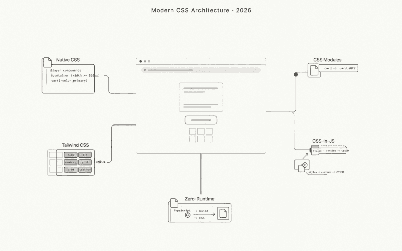
CSS Modules solve naming conflicts. Tailwind provides a utility-first workflow. CSS-in-JS libraries bring styles into JavaScript, while zero-runtime tools move much of that work into the build process.
Meanwhile, CSS itself has gained features that once required preprocessors, JavaScript, or third-party libraries.
There is no universal winner among these approaches.
A small content website has different requirements from an interactive dashboard. A component library needs different guarantees from a landing page. A large application with an established design system may benefit from conventions that would be unnecessary in a smaller project.
The useful distinction is not which syntax looks cleaner. It is where the styling work happens, what reaches the browser, and how difficult the resulting code will be to maintain.
This guide compares the main approaches available in 2026, explains their trade-offs, and shows how modern CSS can reduce the need for additional tooling.
1. Native CSS: More Capable Than It Used to Be
Before introducing another styling library, it is worth looking at what browsers already support.
Modern CSS includes custom properties, nesting, cascade layers, container queries, and scoped styling. These features address several problems that previously pushed developers toward preprocessors or CSS-in-JS.
For many projects, native CSS is a realistic starting point.
CSS custom properties
Custom properties allow styles to share values without repeating them across selectors.
:root {
  --surface-primary: #ffffff;
  --surface-secondary: #f4f4f5;
  --text-primary: #18181b;
  --text-muted: #71717a;
  --border-default: #e4e4e7;

  --radius-card: 12px;
  --space-card: 24px;
}

[data-theme="dark"] {
  --surface-primary: #18181b;
  --surface-secondary: #27272a;
  --text-primary: #fafafa;
  --text-muted: #a1a1aa;
  --border-default: #3f3f46;
}

.content-card {
  padding: var(--space-card);
  border: 1px solid var(--border-default);
  border-radius: var(--radius-card);
  background: var(--surface-primary);
  color: var(--text-primary);
}
Changing the data-theme attribute updates the values used by every matching component.
There is no need to generate a new stylesheet or calculate separate rules for each element.
JavaScript only needs to update the attribute.
function applyColorScheme(preference) {
  const supportedSchemes = new Set(["light", "dark"]);

  if (!supportedSchemes.has(preference)) {
    return;
  }

  document.documentElement.dataset.theme = preference;
}

applyColorScheme("dark");
This approach works with plain HTML, Astro, Vue, Svelte, React, and practically any other frontend environment.
The styling system belongs to CSS rather than a particular component framework.
CSS nesting
Native CSS nesting reduces repetition when selectors share a common parent.
.article-card {
  padding: 1.5rem;
  border: 1px solid #e4e4e7;
  border-radius: 0.75rem;

  & h2 {
    margin: 0;
    font-size: 1.25rem;
  }

  & p {
    color: #52525b;
    line-height: 1.6;
  }

  &:hover {
    border-color: #a1a1aa;
  }

  @media (width >= 768px) {
    padding: 2rem;
  }
}
A separate Sass compilation step is no longer necessary just to nest selectors.
Sass still offers additional features, including mixins and build-time functions, but nesting alone is no longer a compelling reason to introduce it.
Cascade layers
Large stylesheets often become difficult to maintain because selectors compete through specificity and source order.
Cascade layers provide an explicit way to organize the cascade.
@layer reset, base, components, utilities;

@layer base {
  body {
    margin: 0;
    font-family: system-ui, sans-serif;
  }

  button {
    font: inherit;
  }
}

@layer components {
  .action-button {
    padding: 0.75rem 1rem;
    border: 0;
    border-radius: 0.5rem;
    background: #18181b;
    color: white;
  }
}

@layer utilities {
  .visually-hidden {
    position: absolute;
    width: 1px;
    height: 1px;
    overflow: hidden;
    clip-path: inset(50%);
    white-space: nowrap;
  }
}
For normal declarations, a later layer takes precedence over an earlier one, even when the earlier selector is more specific.
This makes the intended priority of different stylesheet groups easier to understand.
One detail matters: unlayered normal declarations have higher precedence than layered normal declarations. Important declarations follow different layer precedence rules.
Layers are useful, but they still require a deliberate strategy.
Container queries
Traditional media queries respond to the viewport.
Container queries respond to the available space inside a particular container.
That distinction is useful for reusable components.
<div class="product-region">
  <article class="product-card">
    <img
      src="/images/headphones.webp"
      alt="Wireless headphones"
      width="640"
      height="480"
    />

    <div class="product-details">
      <h2>Wireless Headphones</h2>
      <p>Lightweight design with active noise cancellation.</p>
      <strong>$149</strong>
    </div>
  </article>
</div>.product-region {
container: product-region / inline-size;
}
.product-card {
display: grid;
gap: 1rem;
padding: 1rem;
border: 1px solid #e4e4e7;
border-radius: 0.75rem;
}
.product-card img {
display: block;
width: 100%;
height: auto;
border-radius: 0.5rem;
}
@container product-region (width >= 520px) {
.product-card {
grid-template-columns: minmax(0, 180px) minmax(0, 1fr);
align-items: center;
}
}The card changes its layout according to the width of .product-region, not the width of the browser window.
It can appear in a narrow sidebar or a wide content area without requiring different component implementations.
CSS @scope
The @scope rule provides another way to limit where selectors apply.
@scope (.documentation-panel) {
  h2 {
    margin-block: 0 1rem;
    font-size: 1.5rem;
  }

  p {
    line-height: 1.7;
    color: #52525b;
  }

  a {
    color: #2563eb;
    text-underline-offset: 3px;
  }
}
These rules target matching elements inside .documentation-panel.
Unlike CSS Modules, @scope does not rename classes. It changes how selectors are scoped in the browser.
The two approaches solve related problems through different mechanisms.
When native CSS makes sense: content websites, small and medium applications, design systems built around CSS variables, and projects that want to minimize dependencies.
Native CSS still requires conventions for naming, file organization, and component boundaries. The language provides the tools, but it does not automatically create an architecture.
2. CSS Modules: Local Styles Without Runtime Generation
CSS Modules solve a problem that appears in almost every growing codebase: class name collisions.
A global .card selector can accidentally affect unrelated elements. As more components are added, keeping class names unique becomes harder.
CSS Modules handle this during compilation.
A class such as .notification is transformed into a generated identifier, while JavaScript receives a mapping between the original and generated names.
A practical example
notification.module.css
.notice {
  display: flex;
  align-items: flex-start;
  gap: 0.875rem;
  padding: 1rem 1.25rem;
  border: 1px solid var(--notice-border);
  border-radius: 0.75rem;
  background: var(--notice-background);
}

.notice[data-kind="success"] {
  --notice-border: #86efac;
  --notice-background: #f0fdf4;
}

.notice[data-kind="error"] {
  --notice-border: #fca5a5;
  --notice-background: #fef2f2;
}

.message {
  margin: 0;
  line-height: 1.5;
}
notification.js
import classes from "./notification.module.css";

function createNotification(message, kind = "success") {
  const allowedKinds = new Set(["success", "error"]);

  const notification = document.createElement("div");
  const content = document.createElement("p");

  notification.className = classes.notice;
  notification.dataset.kind = allowedKinds.has(kind)
    ? kind
    : "success";

  notification.setAttribute(
    "role",
    notification.dataset.kind === "error" ? "alert" : "status"
  );

  content.className = classes.message;
  content.textContent = message;

  notification.append(content);

  return notification;
}

document.body.append(
  createNotification("The file was uploaded successfully.")
);
The JavaScript imports class names, but it does not generate the CSS rules.
Those rules are extracted and processed by the build tool.
This distinction is important. CSS Modules require tooling, but they do not require a browser-side styling runtime.
Dynamic values are still possible
CSS Modules are sometimes described as suitable only for static styling.
That is misleading.
Custom properties can pass dynamic values into compiled CSS.
progress.module.css
.progress-track {
  width: 100%;
  height: 0.625rem;
  overflow: hidden;
  border-radius: 999px;
  background: #e4e4e7;
}

.progress-fill {
  width: var(--completion);
  height: 100%;
  border-radius: inherit;
  background: #18181b;
  transition: width 200ms ease;
}

@media (prefers-reduced-motion: reduce) {
  .progress-fill {
    transition: none;
  }
}
progress.js
import classes from "./progress.module.css";

function createProgressIndicator(initialValue = 0) {
  const track = document.createElement("div");
  const fill = document.createElement("div");

  track.className = classes["progress-track"];
  fill.className = classes["progress-fill"];

  track.setAttribute("role", "progressbar");
  track.setAttribute("aria-label", "Upload progress");
  track.setAttribute("aria-valuemin", "0");
  track.setAttribute("aria-valuemax", "100");

  track.append(fill);

  function updateProgress(nextValue) {
    const normalizedValue = Number.isFinite(nextValue)
      ? Math.min(100, Math.max(0, nextValue))
      : 0;

    fill.style.setProperty(
      "--completion",
      `${normalizedValue}%`
    );

    track.setAttribute(
      "aria-valuenow",
      String(normalizedValue)
    );
  }

  updateProgress(initialValue);

  return {
    element: track,
    update: updateProgress,
  };
}

const uploadProgress = createProgressIndicator(35);

document.body.append(uploadProgress.element);

uploadProgress.update(70);
The stylesheet remains static. Only the custom property changes.
This is often enough for progress indicators, theme colors, component dimensions, and other dynamic values.
The trade-offs
CSS Modules don’t provide a complete design system.
They handle local class names, not design tokens, theme configuration, or component variants.
Those pieces need to be implemented through additional conventions or tools.
For teams that prefer plain CSS, this is usually manageable. Others may want a more structured styling API.
Best suited for: long-lived applications, component-based interfaces, and projects that need predictable CSS without runtime generation.
3. Tailwind CSS: Utility-First Styling
Tailwind changes how styles are authored.
Instead of writing a custom class for each component, developers combine predefined utilities directly in the markup.
Spacing, colors, typography, layout, and responsive behavior can all be expressed through utility classes.
A simple product card
<article
  class="rounded-xl border border-zinc-200 bg-white p-6"
>
  <span
    class="inline-flex rounded-md bg-zinc-100 px-2 py-1 text-xs font-medium text-zinc-700"
  >
    New release
  </span>

  <h2 class="mt-4 text-xl font-semibold text-zinc-900">
    Wireless Headphones
  </h2>

  <p class="mt-2 text-sm leading-6 text-zinc-600">
    Comfortable everyday headphones with active noise cancellation.
  </p>

  <div class="mt-6 flex items-center justify-between">
    <strong class="text-2xl font-bold text-zinc-900">
      $149
    </strong>

    <button
      type="button"
      class="rounded-lg bg-zinc-900 px-4 py-2 text-sm font-medium text-white hover:bg-zinc-700 focus-visible:outline-2 focus-visible:outline-offset-2 focus-visible:outline-zinc-900"
    >
      Add to cart
    </button>
  </div>
</article>
There is no separate component stylesheet.
The HTML contains the styling decisions directly.
For developers familiar with Tailwind, this can make small UI changes faster. There is less switching between markup and CSS files.
The trade-off is longer class attributes.
In large components, the markup can become difficult to scan, particularly when many visual variants are involved.
How Tailwind generates CSS
Tailwind examines source files and identifies utility classes that need corresponding CSS rules.
The build process generates those rules.
It does not need to ship every utility supported by the framework.
Tailwind v4 uses a redesigned engine with an emphasis on fast builds, automatic source detection, and CSS-first configuration.
The output is ordinary CSS. The browser does not need a Tailwind JavaScript runtime to interpret utility classes.
The dynamic class name problem
Tailwind’s source detection depends on finding complete class names.
Consider this example:
function getBadgeClasses(tone) {
  return `bg-${tone}-100 text-${tone}-800`;
}
The class names are assembled at runtime.
A build-time scanner cannot reliably determine every possible result.
A better approach is to declare complete variants.
const badgeVariants = {
  success: "bg-green-100 text-green-800",
  warning: "bg-amber-100 text-amber-800",
  error: "bg-red-100 text-red-800",
};

function createStatusBadge(label, variant = "success") {
  const badge = document.createElement("span");

  const selectedClasses =
    badgeVariants[variant] ?? badgeVariants.success;

  badge.className = [
    "inline-flex rounded-md px-2.5 py-1",
    "text-sm font-medium",
    selectedClasses,
  ].join(" ");

  badge.textContent = label;

  return badge;
}

document.body.append(
  createStatusBadge("Payment received", "success")
);
Every possible utility appears as a complete string in the source.
Tailwind can detect and generate the corresponding CSS.
When Tailwind works well
Tailwind is useful when a team wants to build interfaces quickly while following a shared spacing and color system.
It can be used for prototypes, dashboards, marketing websites, and large production applications.
Its suitability is not determined by project size alone.
A well-organized Tailwind codebase can scale. A poorly organized one can become difficult to maintain, just like a poorly organized collection of CSS files.
The important part is extracting repeated patterns into reusable components or templates.
4. Runtime CSS-in-JS: Styles Generated in JavaScript
CSS-in-JS describes a broad category of tools that allow styles to be written through JavaScript APIs.
Some generate CSS during application execution. Others extract it at build time.
Runtime CSS-in-JS libraries such as Emotion and styled-components belong to the first group.
They can evaluate dynamic expressions, serialize CSS, generate class names, and insert rules into the document.
A framework-independent example
The following example illustrates the basic idea using a small CSS-in-JS API.
It is intentionally a simplified implementation, not a replacement for a production styling library.
const generatedRules = new Map();

function registerStyle(declarations) {
  const serializedStyle = JSON.stringify(declarations);

  if (generatedRules.has(serializedStyle)) {
    return generatedRules.get(serializedStyle);
  }

  const generatedClass = `dynamic-style-${generatedRules.size + 1}`;

  const cssDeclarations = Object.entries(declarations)
    .map(([property, value]) => {
      const cssProperty = property.replace(
        /[A-Z]/g,
        character => `-${character.toLowerCase()}`
      );

      return `${cssProperty}: ${value};`;
    })
    .join(" ");

  const stylesheet = document.createElement("style");

  stylesheet.textContent =
    `.${generatedClass} { ${cssDeclarations} }`;

  document.head.append(stylesheet);

  generatedRules.set(serializedStyle, generatedClass);

  return generatedClass;
}

const highlightedClass = registerStyle({
  backgroundColor: "#18181b",
  color: "#ffffff",
  padding: "12px 18px",
  borderRadius: "8px",
});

const highlightedElement = document.createElement("div");

highlightedElement.className = highlightedClass;
highlightedElement.textContent = "Dynamic styling";

document.body.append(highlightedElement);
This example demonstrates three important operations:
- Serialize the style definition.
- Reuse an existing class when the same style appears again.
- Insert CSS only when a new style is encountered.
Real CSS-in-JS libraries are considerably more sophisticated.
They handle selectors, pseudo-classes, media queries, vendor compatibility, server rendering, caching, and stylesheet insertion.
The simplified example also does not validate CSS declarations or handle untrusted input. It should be treated as an explanation of the mechanism, not a production utility.
Why runtime CSS-in-JS became popular
JavaScript-driven styles can be convenient when visual rules depend heavily on application state.
Component properties can influence colors, dimensions, and variants without requiring a separate mapping for every possible combination.
Libraries may also provide theme providers and APIs for composing styles.
That convenience comes with work that must happen while the application runs.
What does the runtime actually do?
Depending on the library, rendering a styled element may involve:
- Evaluating style expressions.
- Serializing the result.
- Calculating a cache key or class name.
- Looking up previously generated styles.
- Inserting new CSS rules when necessary.
Caching reduces repeated work.
A component using the same style definition on multiple renders does not necessarily trigger repeated CSS insertion.
Problems are more likely when applications continuously produce unique styles.
For example, generating a separate class for every mouse coordinate or animation frame is rarely useful.
CSS custom properties are often a better fit for values that change frequently.
Emotion and styled-components
Emotion supports style objects and template literals. It also offers framework-specific integrations.
styled-components focuses on a styled-component API and has been widely used in component-based applications.
Both remain relevant to existing codebases.
However, styled-components entered maintenance mode in 2025. That is an important consideration for new projects, even though existing applications may continue using it successfully.
Runtime CSS-in-JS is not inherently a bad choice. It simply introduces a different balance between developer convenience and browser-side work.
5. Zero-Runtime CSS-in-JS: Moving Work to the Build
Zero-runtime CSS-in-JS approaches the same problem from another direction.
Developers write styles using JavaScript or TypeScript syntax, but the tooling extracts those styles during compilation.
The browser receives generated CSS files and class names.
There is no need to serialize and inject those static rules during rendering.
Linaria and vanilla-extract are examples of this approach.
Type-safe styles with vanilla-extract
vanilla-extract allows styles to be defined in TypeScript.
status.css.ts
import {
  style,
  styleVariants,
} from "@vanilla-extract/css";

export const statusBase = style({
  display: "inline-flex",
  alignItems: "center",
  padding: "6px 12px",
  borderRadius: "999px",
  fontSize: "14px",
  fontWeight: 600,
});

export const statusVariants = styleVariants({
  neutral: {
    backgroundColor: "#f4f4f5",
    color: "#27272a",
  },
  positive: {
    backgroundColor: "#dcfce7",
    color: "#166534",
  },
  warning: {
    backgroundColor: "#fef3c7",
    color: "#92400e",
  },
});
The resulting class names can be imported into application code.
status.ts
import {
  statusBase,
  statusVariants,
} from "./status.css";

type StatusVariant = keyof typeof statusVariants;

export function createStatusElement(
  label: string,
  variant: StatusVariant = "neutral"
): HTMLSpanElement {
  const statusElement = document.createElement("span");

  statusElement.className = [
    statusBase,
    statusVariants[variant],
  ].join(" ");

  statusElement.textContent = label;

  return statusElement;
}
The browser does not need vanilla-extract to generate those styles.
They already exist in the compiled CSS.
TypeScript also helps prevent invalid variant names.
Dynamic values with CSS variables
Build-time extraction does not prevent all runtime customization.
A static CSS rule can reference a custom property, while JavaScript supplies its value.
panel.css.ts
import {
  createVar,
  style,
} from "@vanilla-extract/css";

export const panelWidthVariable = createVar();

export const panelSurface = style({
  width: panelWidthVariable,
  maxWidth: "100%",
  padding: "20px",
  border: "1px solid #e4e4e7",
  borderRadius: "12px",
});
panel.ts
import { assignInlineVars } from "@vanilla-extract/dynamic";

import {
  panelSurface,
  panelWidthVariable,
} from "./panel.css";

export function createResizablePanel(
  requestedWidth: number
): HTMLElement {
  const panelElement = document.createElement("section");

  const calculatedWidth = Number.isFinite(requestedWidth)
    ? Math.max(200, requestedWidth)
    : 320;

  panelElement.className = panelSurface;

  Object.assign(
    panelElement.style,
    assignInlineVars({
      [panelWidthVariable]: `${calculatedWidth}px`,
    })
  );

  return panelElement;
}
The CSS rule is generated during the build. JavaScript changes only the variable.
This is similar to the CSS Modules example, but the style definitions are written through a typed API.
Where zero-runtime reaches its limits
CSS variables can replace property values.
They cannot dynamically create arbitrary selectors or media-query conditions.
For example, a breakpoint that depends on a runtime value cannot simply be inserted into a statically extracted @media rule through a CSS custom property.
That structure must be known during compilation, expressed through predefined variants, or handled with another mechanism.
Zero-runtime styling is attractive when most styles can be expressed through static rules and controlled variations.
It is less convenient when the structure of the CSS itself needs to change dynamically.
6. Build Time vs. Runtime: The Real Architectural Difference
The most important distinction between these tools is where CSS generation happens.
Consider three possible workflows.
Static CSS and CSS Modules
The build tool processes the styles and produces a CSS file.
The browser downloads that file and applies the rules.
JavaScript may change classes or custom properties, but it does not need to generate the stylesheet.
Tailwind
The build tool scans source files for utilities.
It generates the CSS required by the detected classes.
The browser receives ordinary CSS and applies it to elements using those class names.
Runtime CSS-in-JS
The application includes JavaScript responsible for handling styles.
Depending on the library and rendering strategy, it may generate or insert CSS rules when components are rendered.
Caching and server-side extraction can reduce the cost, but some styling work remains part of the runtime architecture.
Zero-runtime CSS-in-JS
Styles are authored in JavaScript or TypeScript, then extracted during compilation.
The resulting application uses generated class names and static CSS.
Runtime values can still be passed through custom properties.
The following table summarizes the differences.
| Approach | CSS generation | Runtime styling work | Main trade-off |
|---|---|---|---|
| Native CSS | Authored directly | Browser style processing | Manual organization |
| CSS Modules | Build time | Class and variable updates | Requires build tooling |
| Tailwind CSS | Build time | Class and variable updates | Utility-heavy markup |
| Runtime CSS-in-JS | Runtime, potentially with SSR extraction | Serialization, caching, insertion | JavaScript overhead |
| Zero-runtime CSS-in-JS | Build time | Class and variable updates | Compile-time restrictions |
All approaches still require the browser to calculate styles.
Zero-runtime does not mean zero browser work. It means the styling tool avoids generating its CSS rules during application execution.
7. What Happens When CSS Reaches the Browser?
No matter how styles are authored, the browser eventually needs to interpret them.
Understanding that process is more useful than relying on assumptions about which styling library is fastest.
CSS parsing and CSSOM
The browser parses stylesheets and builds a representation of their rules called the CSS Object Model.
Those rules participate in determining the computed styles of elements.
The browser also considers the DOM, selector matching, inheritance, and the cascade.
Style recalculation
When a class, custom property, or stylesheet rule changes, the browser may need to recalculate styles.
The amount of work depends on the selectors involved and which elements are affected.
A small change does not necessarily require recalculating the entire page.
Layout
Some properties affect geometry.
Changing width, height, padding, or other layout-related values may require the browser to calculate positions and dimensions again.
Frequent layout work can become expensive, particularly in large documents.
Paint and compositing
Other changes affect how elements are drawn.
Background colors, borders, and shadows may trigger painting.
Animations using transform and opacity can often avoid repeated layout calculations, although their actual behavior depends on the browser and page structure.
This is one reason a performance issue should be measured before blaming the styling approach.
Finding CSS performance problems
Chrome DevTools provides a practical way to investigate.
The Performance panel can show events such as:
- Recalculate Style
- Layout
- Paint
- Long Tasks
If an application repeatedly inserts new CSS rules during an interaction, its styling runtime may be contributing to the problem.
If the expensive work is layout, changing from CSS-in-JS to CSS Modules may not address the real cause.
Performance improvements should follow evidence, not assumptions.
8. CSS Architecture and Server Rendering
Server rendering introduces another consideration: styles need to be available when the initial HTML reaches the browser.
This applies to applications using server-side rendering, static generation, or a combination of server and client rendering.
Static CSS approaches are relatively straightforward.
CSS Modules, Tailwind, and build-time extraction tools produce stylesheets that can be delivered alongside HTML.
Runtime CSS-in-JS may require additional integration.
The server needs to collect or generate the styles used by rendered content and include them in the response.
Otherwise, the browser may briefly display unstyled content before the client-side styling code runs.
This is commonly known as a flash of unstyled content, or FOUC.
The exact setup depends on the framework and styling library.
A library that works well in a client-rendered application may require extra configuration in a server-rendered environment.
There is no need to reject runtime CSS-in-JS solely because an application uses SSR. Compatibility should be checked against the actual rendering architecture.
For new projects that don’t need runtime stylesheet generation, static CSS often provides a simpler starting point.
9. Choosing a CSS Architecture
A styling decision should begin with the requirements of the project.
The following recommendations are useful starting points rather than strict rules.
| Project type | Reasonable starting point | Why |
|---|---|---|
| Small content website | Native CSS | Few dependencies and simple maintenance |
| Component-based application | CSS Modules | Local styles and predictable output |
| Rapidly changing product | Tailwind CSS | Fast utility-first workflow |
| Large typed design system | vanilla-extract | Typed variants and build-time extraction |
| Existing runtime CSS-in-JS application | Keep the current solution initially | Migration may cost more than continued support |
| Performance-sensitive interface | Static CSS or zero-runtime tools | Avoids runtime stylesheet generation |
| Framework-independent component library | Native CSS, CSS Modules, or extracted CSS | Reduces dependence on a particular rendering runtime |
The table doesn’t account for every requirement.
Team experience, framework support, browser targets, design-system complexity, and existing infrastructure can change the decision.
A familiar tool with clear conventions may be more valuable than a technically elegant alternative that nobody on the team understands.
10. Principles That Matter More Than the Library
Some styling problems appear regardless of which tool a project uses.
Keep design tokens centralized
Colors, spacing, typography, and radii should not be copied into every component.
CSS custom properties provide a portable foundation.
:root {
  --color-brand: #2563eb;
  --color-surface: #ffffff;
  --color-text: #18181b;

  --space-small: 0.5rem;
  --space-medium: 1rem;
  --space-large: 1.5rem;

  --radius-small: 0.375rem;
  --radius-medium: 0.75rem;
}
These values can be consumed by native CSS, CSS Modules, or other styling systems.
Prefer explicit variants
Components are easier to maintain when their visual states are predictable.
Instead of allowing arbitrary styling values everywhere, define a small set of supported variants.
const actionVariants = {
  primary: "action action--primary",
  secondary: "action action--secondary",
  destructive: "action action--destructive",
};

function createActionElement(
  label,
  appearance = "primary"
) {
  const actionElement = document.createElement("button");

  actionElement.type = "button";
  actionElement.className =
    actionVariants[appearance] ?? actionVariants.primary;

  actionElement.textContent = label;

  return actionElement;
}
The styling implementation can change later without requiring every caller to understand its internal details.
Avoid unnecessary dynamic CSS generation
Values that change frequently often work better through custom properties.
There is usually no reason to create a new CSS rule for every progress update, drag position, or continuously changing measurement.
Keep the architecture consistent
Mixing native CSS, utility classes, runtime CSS-in-JS, and several preprocessors without clear boundaries makes maintenance harder.
Multiple approaches can coexist successfully, but each should have a defined purpose.
A project does not need to use every available styling tool.
It needs a styling system that developers can understand and maintain.
Final Thoughts
Modern CSS offers more choices than ever, but it also removes some of the reasons those choices originally appeared.
Nesting, custom properties, cascade layers, container queries, and scoped styling make native CSS increasingly capable.
CSS Modules remain a dependable way to organize local styles. Tailwind offers a fast utility-first workflow. Runtime CSS-in-JS provides flexible JavaScript-driven styling, while zero-runtime tools move more work into compilation.
Each approach has strengths and limitations.
For new projects, native CSS and build-time styling are sensible defaults when runtime generation provides no clear benefit. Existing applications should be evaluated on their actual maintenance and performance needs rather than the popularity of a newer library.
The best CSS architecture is not necessarily the one with the most features.
It is the one that keeps styling predictable, supports the application’s requirements, and remains understandable as the project grows.