
The modern web platform continues evolving with small but powerful
improvements. Two recent additions --- ToggleEvent.source and the
closedby attribute for <dialog> --- make working with dialogs
and popovers significantly easier.
ToggleEvent.source allows developers to determine which element
triggered a popover or dialog visibility change, while closedby
allows you to declare how a dialog can be closed without writing
extra JavaScript.
These additions move the web platform further toward declarative UI behavior.
ToggleEvent.source
The source property of the ToggleEvent interface is a
read‑only reference to the element that triggered the toggle event.
In simple terms, it tells you:
Which element opened or closed a popover or dialog.
The property returns an instance of Element.
If the visibility change was triggered programmatically, the value
will be null.
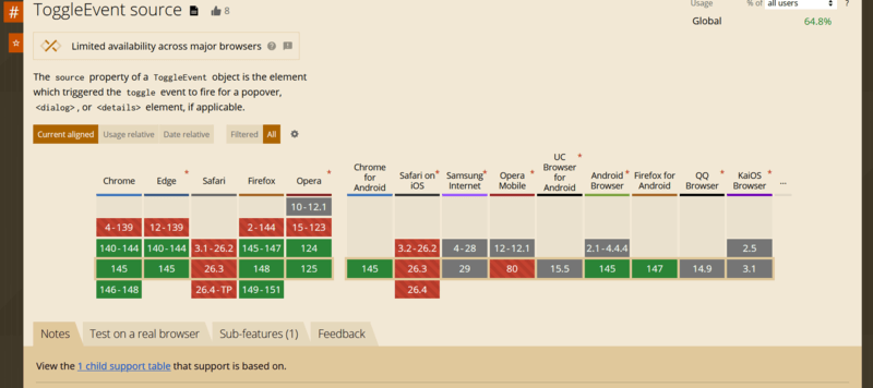
Browser support
Most modern browsers already support the property. Safari currently exposes it behind an experimental flag.
Elements that can trigger popovers
A popover can be triggered by:
-
<button commandfor="...">commandfor attribute -
<button popovertarget="...">popovertarget attribute -
<input type="button" popovertarget="...">
Elements that can behave as popovers
-
<dialog> - Any element with the
popoverattribute
Example
Consider a dialog with multiple buttons that close it.
We want to determine which button closed the dialog and display the result.
<div>
  <button commandfor="my-dialog" command="show-modal">
    Show modal dialog
  </button>

  <dialog id="my-dialog">
    <h3>Do you like modern Web APIs?</h3>

    <div style="display:flex; gap:10px">
      <button commandfor="my-dialog" command="close" data-answer="yes">
        Yes
      </button>

      <button commandfor="my-dialog" command="close" data-answer="sure">
        Sure
      </button>
    </div>
  </dialog>

  <p>No answer yet</p>
</div>
Now we listen for the toggle event.
const paragraph = document.querySelector("p");

document.querySelector("dialog").addEventListener("toggle", (event) => {

  if (!(event.source instanceof HTMLButtonElement)) return;

  const { answer } = event.source.dataset;

  if (answer) {
    paragraph.textContent = `Answer: ${answer}`;
  }

});
With ToggleEvent.source, determining the trigger element becomes
trivial.
HTMLDialogElement.closedBy
The closedby attribute defines which user actions are allowed to
close a dialog.
Previously, developers often needed custom JavaScript logic to control this behavior. Now it can be defined directly in HTML.
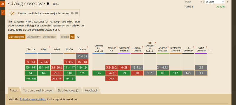
This attribute is supported by all major browsers (Safari currently ships it behind an experimental flag).
Supported closing actions
Dialogs can be closed by:
- Clicking outside the dialog on the overlay (light dismiss).
- Platform actions such as pressing Esc.
- A developer-defined action such as a button calling
dialog.close().
Attribute values
any
The dialog can be closed using all methods above.
closerequest
The dialog can be closed by:
- pressing Esc
- developer-defined logic
none
The dialog can only be closed programmatically or by explicit UI controls.
Default behavior
The default value depends on how the dialog is opened.
If opened using: showModal(), the default becomes: closerequest.
Otherwise the default is: none
Why this matters
Before closedby, implementing overlay click closing required JavaScript logic, such as custom hooks (useClickOutside in React).
Now this behavior can be defined purely declaratively.
Example with multiple dialogs
<div class="demo">
  <button class="open" commandfor="dlg-any" command="show-modal">
    Open dialog (closedby="any")
  </button>

  <!-- 1) closedby="any" -->
  <dialog id="dlg-any" closedby="any">
    <div class="dialog">
      <header class="header">
        <h3>Dialog A — closedby="any"</h3>
        <button class="icon" commandfor="dlg-any" command="close" aria-label="Close">
          ✖
        </button>
      </header>

      <p>
        This dialog can be closed by clicking the backdrop, pressing Esc, or using a Close button.
      </p>

      <footer class="footer">
        <button class="cancel" commandfor="dlg-any" command="close">Close</button>

        <button class="confirm" commandfor="dlg-closerequest" command="show-modal">
          Open dialog B
        </button>
      </footer>
    </div>
  </dialog>

  <!-- 2) closedby="closerequest" -->
  <dialog id="dlg-closerequest" closedby="closerequest">
    <div class="dialog">
      <header class="header">
        <h3>Dialog B — closedby="closerequest"</h3>
        <button class="icon" commandfor="dlg-closerequest" command="close" aria-label="Close">
          ✖
        </button>
      </header>

      <p>
        This dialog closes via Esc or explicit controls. Clicking the backdrop should NOT close it.
      </p>

      <footer class="footer">
        <button class="cancel" commandfor="dlg-closerequest" command="close">Close</button>

        <button class="confirm" commandfor="dlg-none" command="show-modal">
          Open dialog C
        </button>
      </footer>
    </div>
  </dialog>

  <!-- 3) closedby="none" -->
  <dialog id="dlg-none" closedby="none">
    <div class="dialog">
      <header class="header">
        <h3>Dialog C — closedby="none"</h3>
        <button class="icon" commandfor="dlg-none" command="close" aria-label="Close">
          ✖
        </button>
      </header>

      <p>
        This dialog can ONLY be closed by explicit controls (your buttons / JS). Esc and backdrop
        clicks should NOT close it.
      </p>

      <footer class="footer">
        <button class="cancel" commandfor="dlg-none" command="close">Close</button>
      </footer>
    </div>
  </dialog>
</div>
Styling dialogs
Basic styles might look like this:
:root {
  --p: 6px;
}

.demo {
  font-family: system-ui, sans-serif;
  display: grid;
  place-items: center;
  min-height: 50vh;
  gap: calc(var(--p) * 4);
}

button {
  padding: calc(var(--p) * 2) calc(var(--p) * 4);
  border: 0;
  border-radius: calc(var(--p) * 2);
  cursor: pointer;
}

button:focus-visible {
  outline: 2px solid #000;
  outline-offset: 2px;
}

button.open {
  background: #0d6efd;
  color: #fff;
}

dialog {
  padding: 0;
  border: 0;
  background: transparent;
}

dialog::backdrop {
  background: rgba(0, 0, 0, 0.15);
}

.dialog {
  background: #fff;
  min-width: 320px;
  max-width: 520px;
  border-radius: calc(var(--p) * 2);
  padding: calc(var(--p) * 4);
  box-shadow: 0 6px 18px rgba(0, 0, 0, 0.15);
  display: grid;
  gap: calc(var(--p) * 3);
}

.header {
  display: flex;
  align-items: center;
  justify-content: space-between;
  gap: calc(var(--p) * 2);
}

.header h3 {
  margin: 0;
  font-size: 1.1rem;
}

button.icon {
  padding: var(--p) calc(var(--p) * 2);
  background: transparent;
  font-size: 1rem;
}

.footer {
  display: flex;
  justify-content: flex-end;
  gap: calc(var(--p) * 2);
}

button.cancel {
  background: #dc3545;
  color: #fff;
}

button.confirm {
  background: #198754;
  color: #fff;
}
The stacked overlay problem
If multiple dialogs are opened, their backdrops stack visually. Because each backdrop is semi‑transparent, the page becomes darker with every dialog.
Ideally we would only display the backdrop of the top dialog.
Unfortunately, CSS currently has no selector that targets the top dialog in the browser’s dialog stack.
Practical workaround with MutationObserver
A simple workaround is tracking open dialogs with JavaScript.
First adjust the CSS.
dialog::backdrop {
  background: transparent;
}

dialog.active::backdrop {
  background: rgba(0,0,0,0.15);
}
Then track dialogs:
let dialogs = []

const observer = new MutationObserver((mutations) => {

  mutations.forEach((mutation) => {

    if (mutation.attributeName === "open") {

      const dialog = mutation.target

      if (dialog.open) {
        dialogs.push(dialog)
      } else {
        dialogs = dialogs.filter(d => d !== dialog)
      }

      dialogs.forEach((d, i) => {

        if (i === dialogs.length - 1) {
          d.classList.add("active")
        } else {
          d.classList.remove("active")
        }

      })

    }

  })

})

document.querySelectorAll("dialog").forEach(dialog => {
  observer.observe(dialog, { attributes: true })
})
This ensures that only the top dialog displays a backdrop, preventing visual stacking.
Final thoughts
ToggleEvent.source and dialog.closedby may appear small, but they
represent meaningful progress in the evolution of the Web APIs.
They simplify event handling, reduce the need for custom JavaScript, and move UI behavior closer to declarative HTML patterns.
As browsers continue expanding support for popovers and dialogs, these APIs will likely become essential tools for building modern web interfaces.
Happy coding.